How to Make Lines Look Thinner on Squarespace (Without Code!)
If you’ve ever looked at your Squarespace site and thought, “Hmm…this line feels a little heavy,” you're not alone. Divider lines, navigation borders, accordion separators – they all add structure, but sometimes they can look visually thicker than you’d like.
Good news: you don’t need custom CSS to refine them. You just need one tiny trick.
Spoiler: it’s all in the opacity.
Below, we’re walking through exactly how we finesse line weight across Squarespace, from navigation borders to accordion dividers – using simple design tools already built into the platform.
Yes, this works on any Squarespace 7.1 template and yes, you can do it in seconds!
Navigation Bottom Border
Your site header comes with a built-in border option, but the default stroke can feel bolder than intended – especially on minimalist designs.
To soften it:
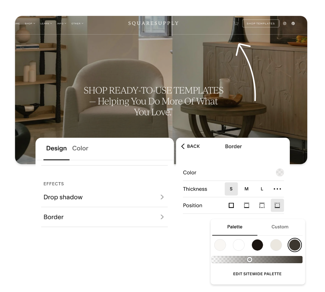
Open Header → Navigation in the design panel
Select Border
Choose your colour
Drag the opacity slider down slightly
This keeps the line structure in place while making it optically thinner and lighter – perfect for delicate, editorial-style sites.
Divider Lines in Layouts
Dividers inside your content areas (accordion blocks, text sections, columns etc.) behave the same way.
To adjust them individually:
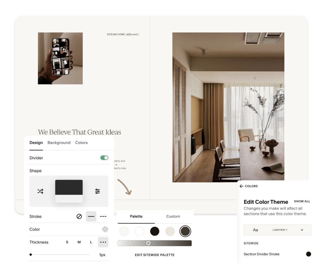
Click on the Divider block inside your layout
Open Design
Adjust the Stroke colour opacity to reduce the visual weight
Keep the thickness on the lightest setting
Or, adjust them globally for an entire colour theme via:
Site Styles → Color Theme → Section Divider Stroke
Lower opacity = thinner-looking lines across every section that uses that theme.
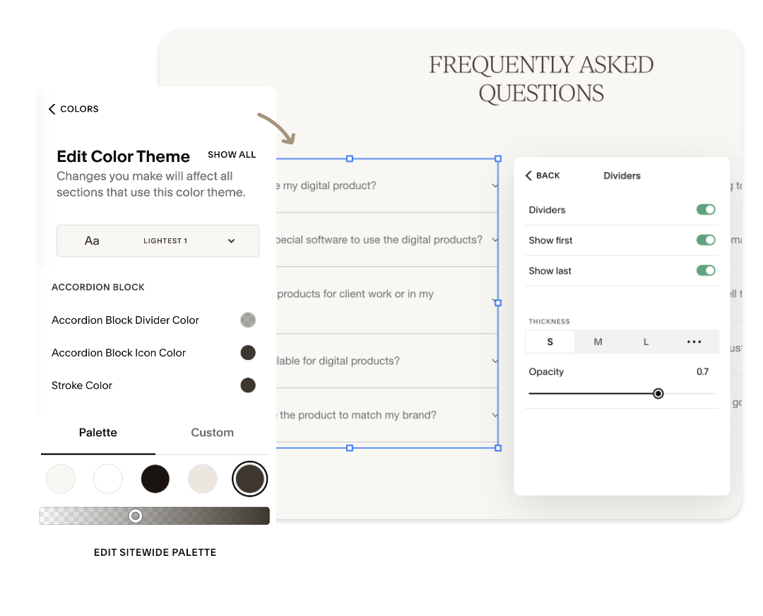
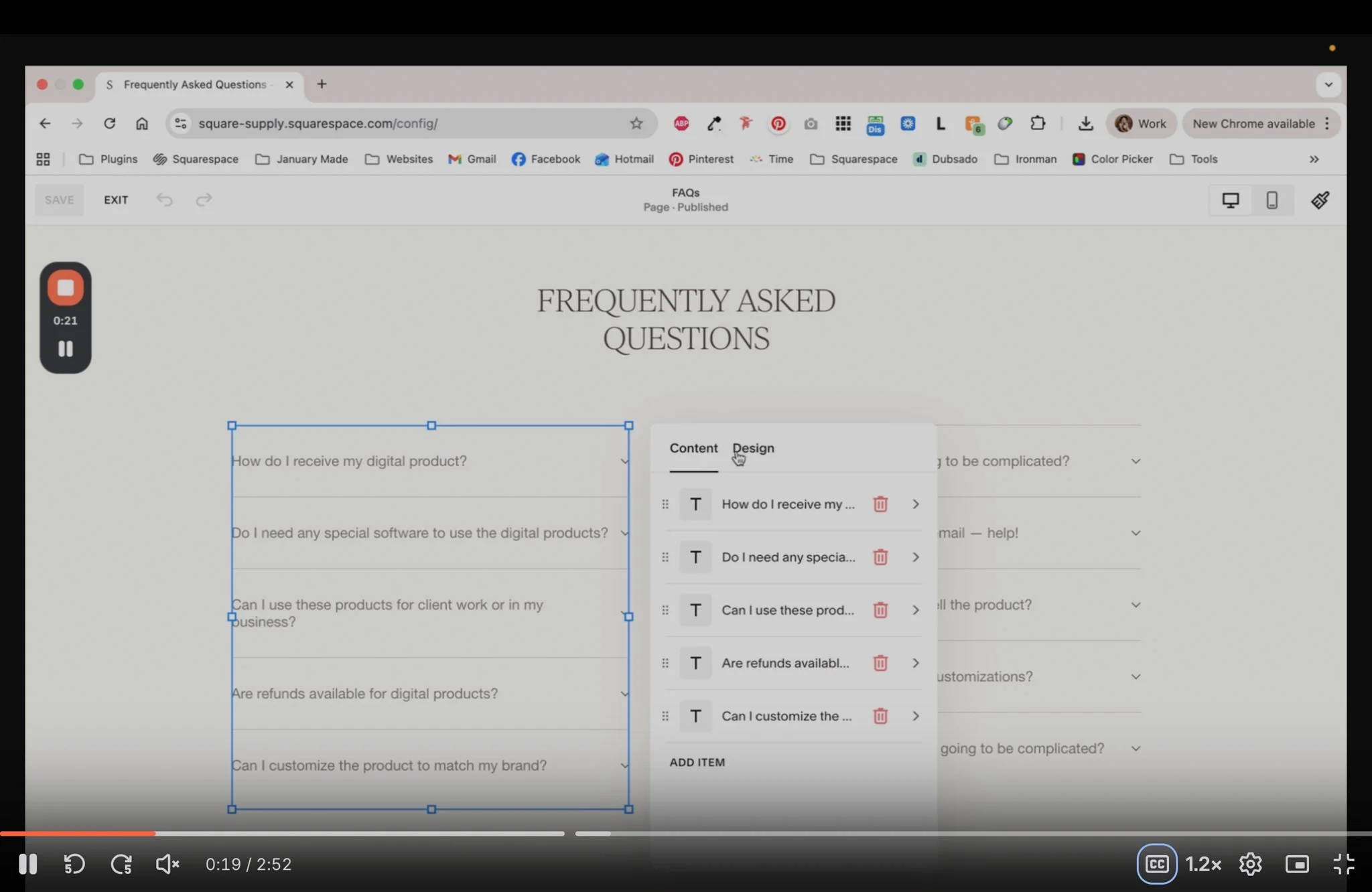
Accordion Divider Lines
Accordions come with their own divider settings, and by default, they’re quite bold. To refine them:
Open the accordion block
Go to Design → Dividers
Lower the Opacity slider
For global control, navigate to:
Site Styles → Color Theme → Accordion Block Divider Color
This updates every accordion using that colour theme, keeping your design consistent across the site.
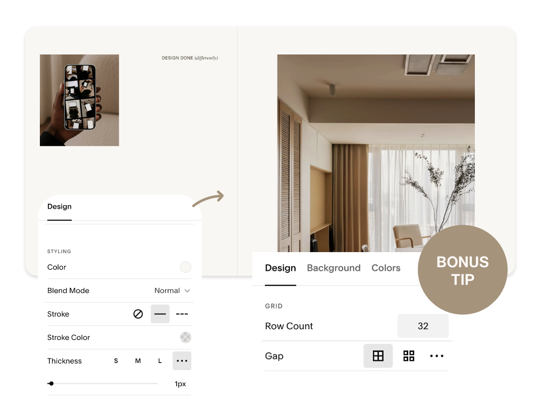
Thin Vertical Lines (Without Code!)
Vertical lines require a tiny workaround, but it’s beautifully simple:
Add a Shape Block
Turn on Stroke
Lower the Stroke Color opacity
Set thickness to 1px
Then:
Duplicate the shape
Place the shapes side-by-side
Update the Section Grid → Gap to “0” for seamless alignment
This gives you elegant vertical separators without touching CSS – perfect for service lists, pricing layouts, or side-by-side content.
Why This Trick Works
Squarespace’s design controls don’t offer ultra-thin stroke widths for every block. But by lowering opacity, you’re visually reducing contrast – which naturally makes the line appear finer and softer.
It’s an easy, designer-friendly workaround that gives your website the polished, editorial feel of a fully custom build.
Want More Squarespace Design Tips?
We share these little behind-the-scenes tricks inside our templates, guides, and monthly emails.
If you’re building your own site (or leveling up client sites), you’ll love what’s coming up.
Stay tuned for the next tip – and happy designing!
Nicole & Creative Process Co.